Technology Stack


Project Overview
As a senior frontend engineer, I had the opportunity to lead the design and development of a responsive website for Attryb, a cutting-edge SaaS company offering an AI-powered Marketing Stack. This project was not just about creating a visually appealing website; it was about crafting a digital experience that effectively communicates Attryb’s unique value proposition and showcases their innovative solutions for hyper-personalized customer journeys.
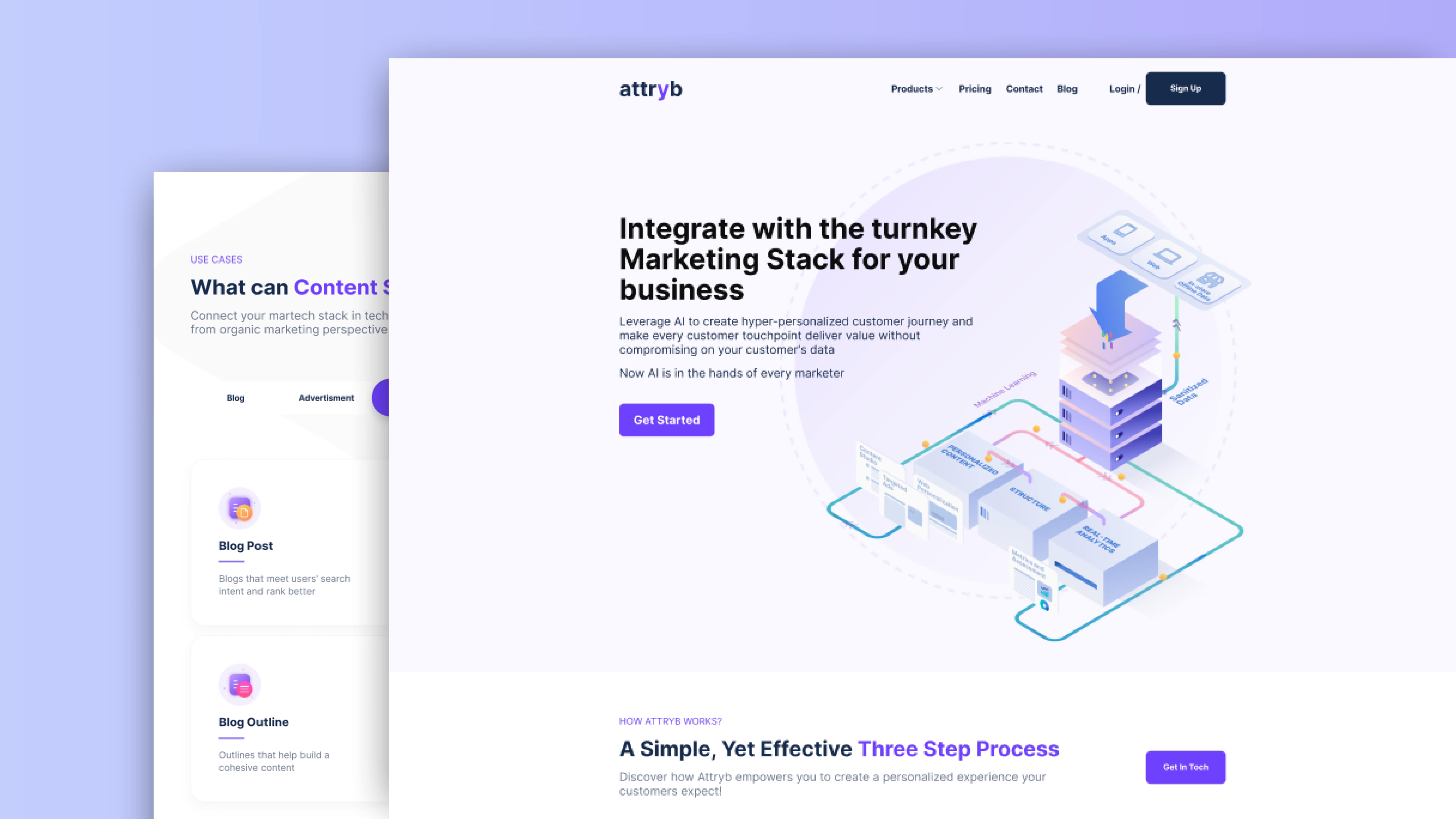
The Attryb SaaS website project encompassed a wide range of features, from an engaging landing page to detailed product showcases and a content-rich blog section. Our primary focus was on delivering an exceptional user experience across all devices, leveraging interactive components and smooth animations to captivate visitors and encourage deeper exploration of Attryb’s offerings.
Objectives
The project had several key objectives that guided our development process:
- Create a responsive, visually striking website that effectively communicates Attryb’s brand identity and value proposition to potential customers.
- Implement interactive components and smooth animations to enhance user engagement and showcase the platform’s capabilities.
- Optimize website performance across all devices to ensure fast load times and smooth navigation, crucial for maintaining visitor interest in a competitive SaaS landscape.
- Develop a scalable and maintainable codebase that allows for easy future updates and additions to the website.
- Integrate a user-friendly content management system to empower Attryb’s marketing team to easily update product information and publish new blog content.
Domain and Industry Context
To fully appreciate the significance of this project, it’s essential to understand the context of the Marketing Technology (MarTech) industry in which Attryb operates. AI-powered personalization and copywriting tools, like those offered by Attryb, are at the forefront of modern marketing strategies. These solutions fall under several crucial subdomains of MarTech, including Customer Relationship Management (CRM), Content Management Systems (CMS), Marketing Automation, and Data Management Platforms (DMP).
The MarTech industry is rapidly evolving, with businesses increasingly seeking integrated solutions that can collect and analyze customer data, generate personalized content, and optimize delivery across various channels. Attryb’s AI-powered Marketing Stack addresses these needs by combining advanced data analysis, natural language processing, and machine learning to create highly targeted and engaging customer experiences.
By developing a website that effectively showcases these capabilities, we’re not just creating a digital brochure – we’re providing a window into the future of marketing technology. Our goal was to design an online experience that reflects the sophistication and effectiveness of Attryb’s tools, helping potential customers understand the transformative power of AI-driven marketing solutions.
Features
Landing Page
The landing page serves as the digital front door for Attryb, designed to make a powerful first impression and clearly communicate the company’s value proposition. Using React.js, we crafted a clean, modern interface that immediately captures visitors’ attention with a bold hero section featuring a concise tagline and a prominent call-to-action.
As users scroll, they’re greeted with smoothly animated sections that highlight key features of Attryb’s AI-powered Marketing Stack, each accompanied by eye-catching illustrations or icons. We implemented a sticky navigation bar to ensure easy access to different sections of the site, enhancing overall user experience and encouraging exploration.

Content Studio
The Content Studio product page showcases one of Attryb’s core offerings, demonstrating how businesses can streamline their content creation process. We leveraged React’s state management capabilities to create interactive demos that allow visitors to experience the power of AI-driven content generation firsthand. The page features a dynamic interface where users can input basic parameters and watch as the AI generates tailored content suggestions in real-time.

Pricing Page
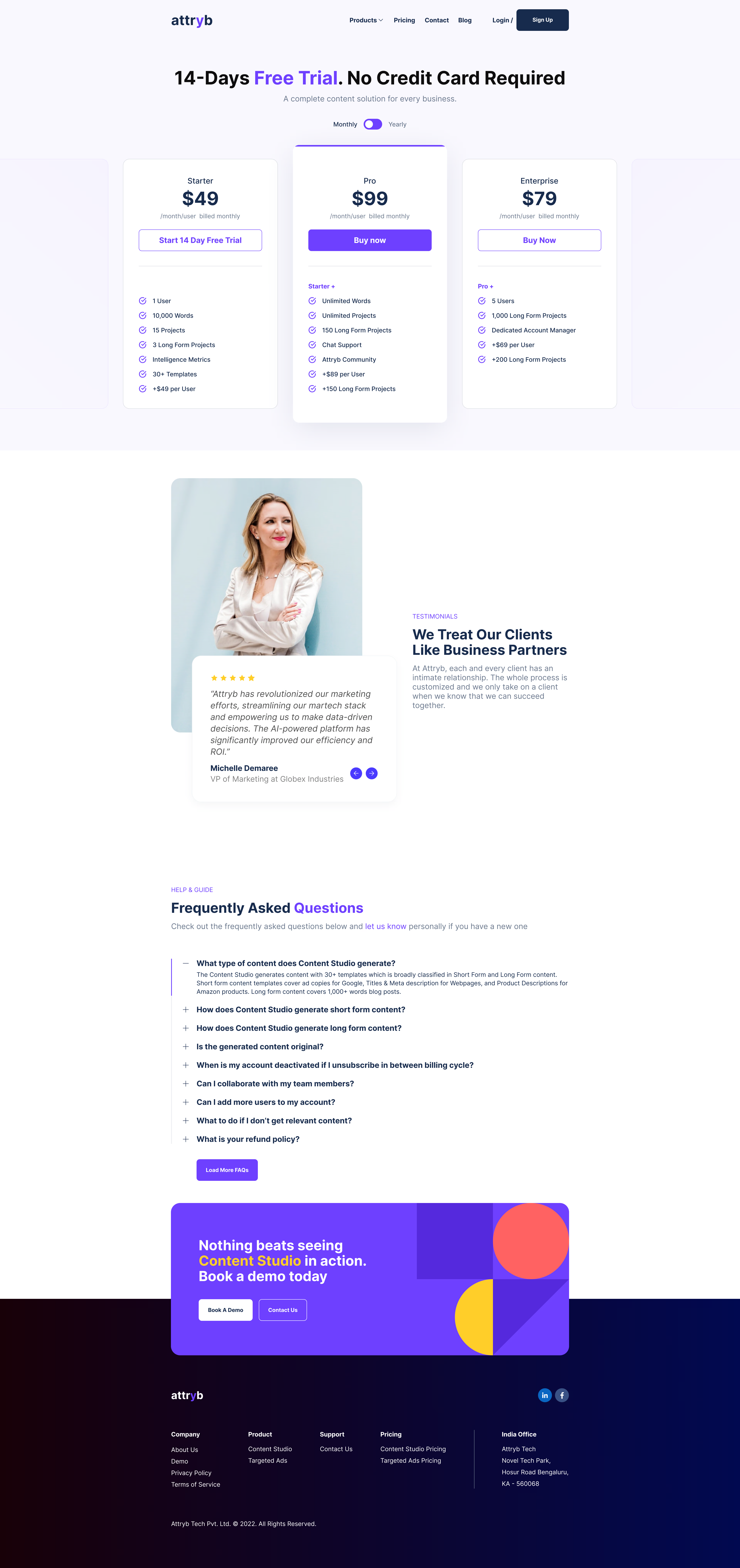
Transparency in pricing is crucial for SaaS products, and our pricing page was designed with this in mind. Using flexbox and CSS media queries, we created a responsive layout that clearly presents Attryb’s different pricing tiers. Each plan is displayed in a card format, with a hover effect that subtly highlights the card to improve user interaction.
We implemented a toggle switch that allows users to easily switch between monthly and annual pricing options, with the annual discount prominently displayed to encourage long-term commitments. The page also features an FAQ section addressing common pricing-related queries, helping to alleviate potential customer concerns and streamline the decision-making process.
Contact Us Page
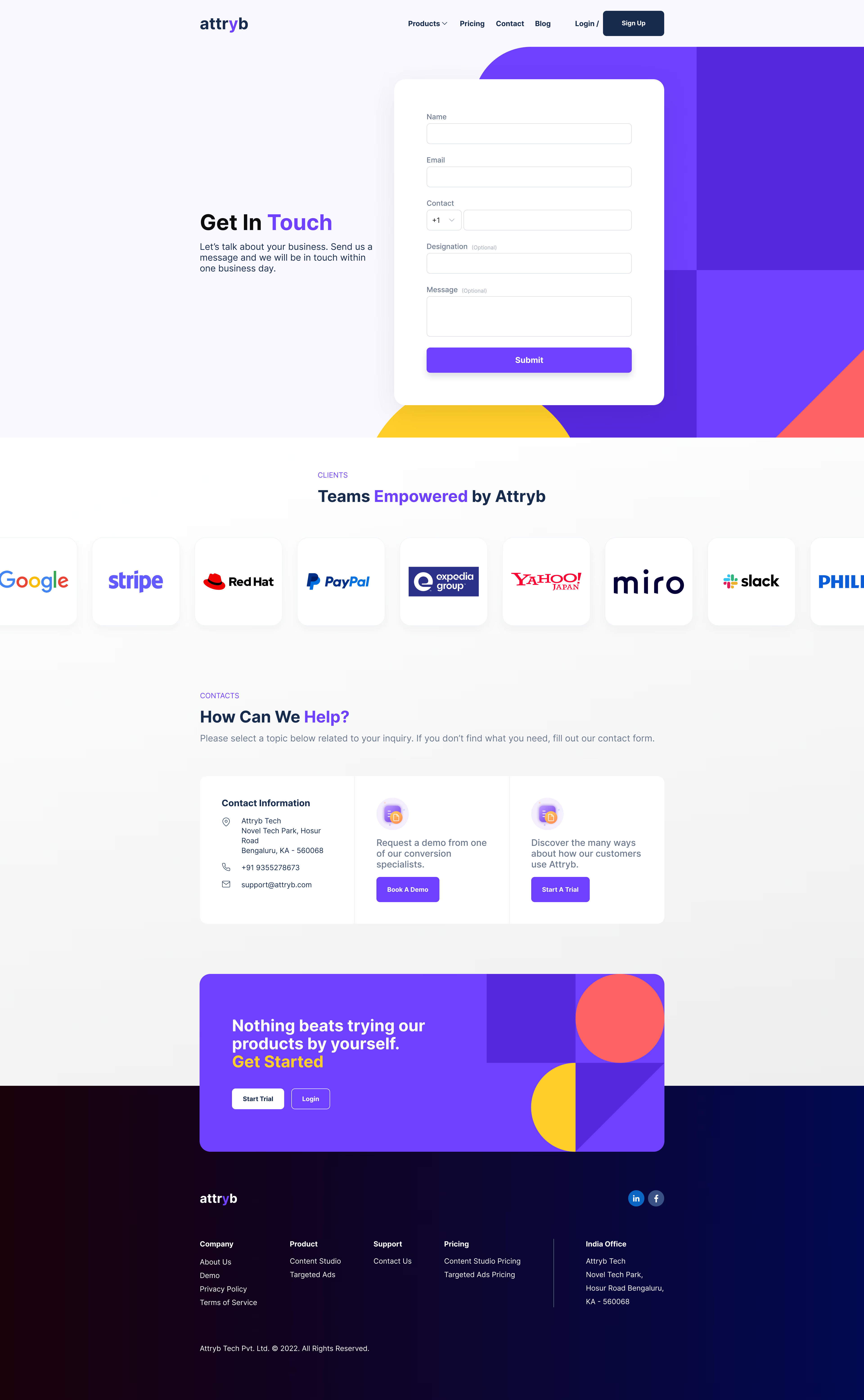
The Contact Us page was designed to provide multiple avenues for potential customers to reach out to Attryb. Centerpiece of this page is a sleek contact form built using React’s form handling and validation techniques. The form adapts to user input in real-time, providing immediate feedback on field completion and highlighting any errors.
Blog Listing
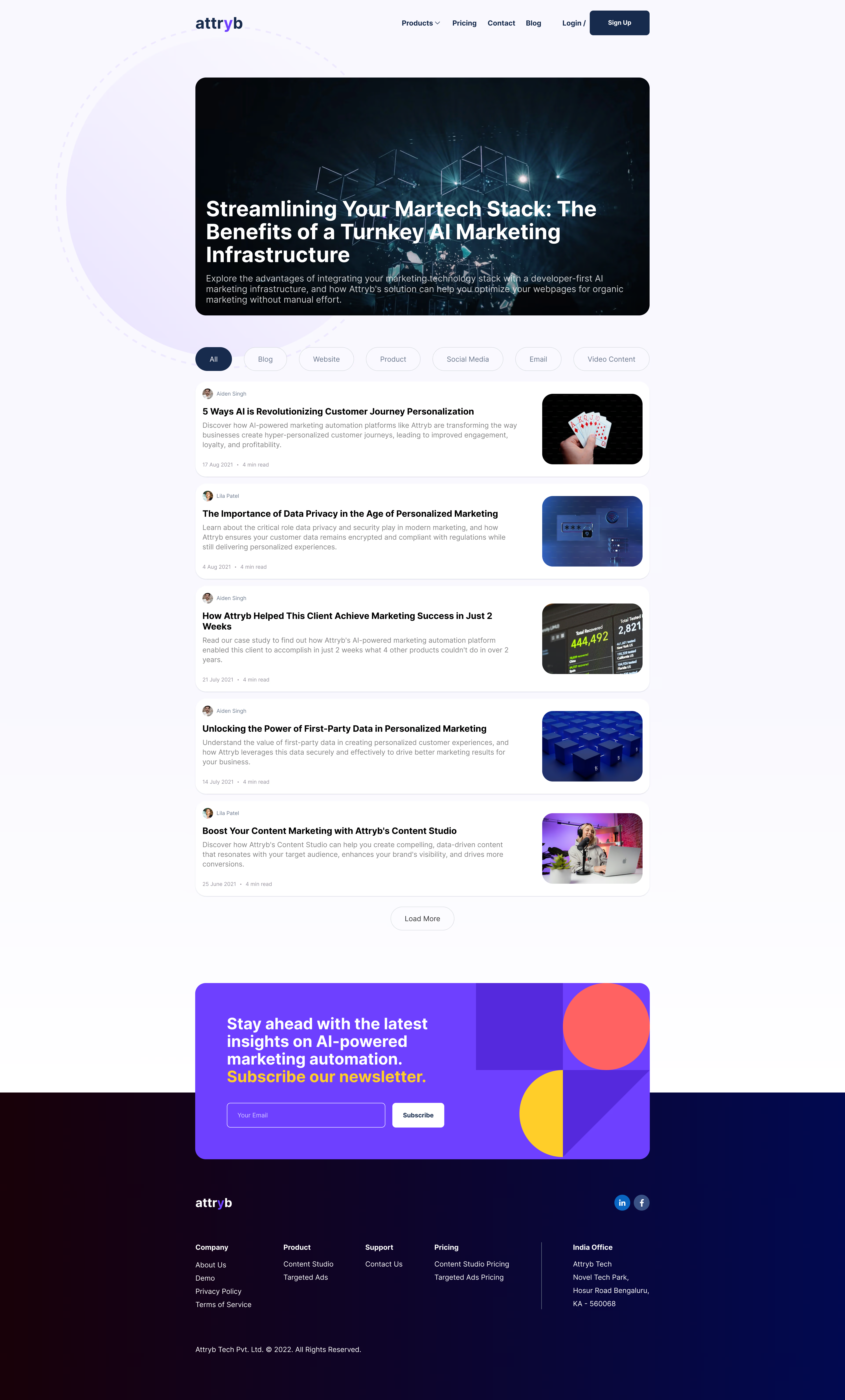
The blog listing page serves as a content hub, showcasing Attryb’s thought leadership in the MarTech space. We implemented a list-style layout using React’s component composition, creating a visually interesting and responsive display of blog post previews. Each preview card includes the post’s featured image, title, author, publication date, and a brief excerpt. We incorporated a tab based grouping system that allows users to filter posts by category enhancing content discoverability.
Blog Post
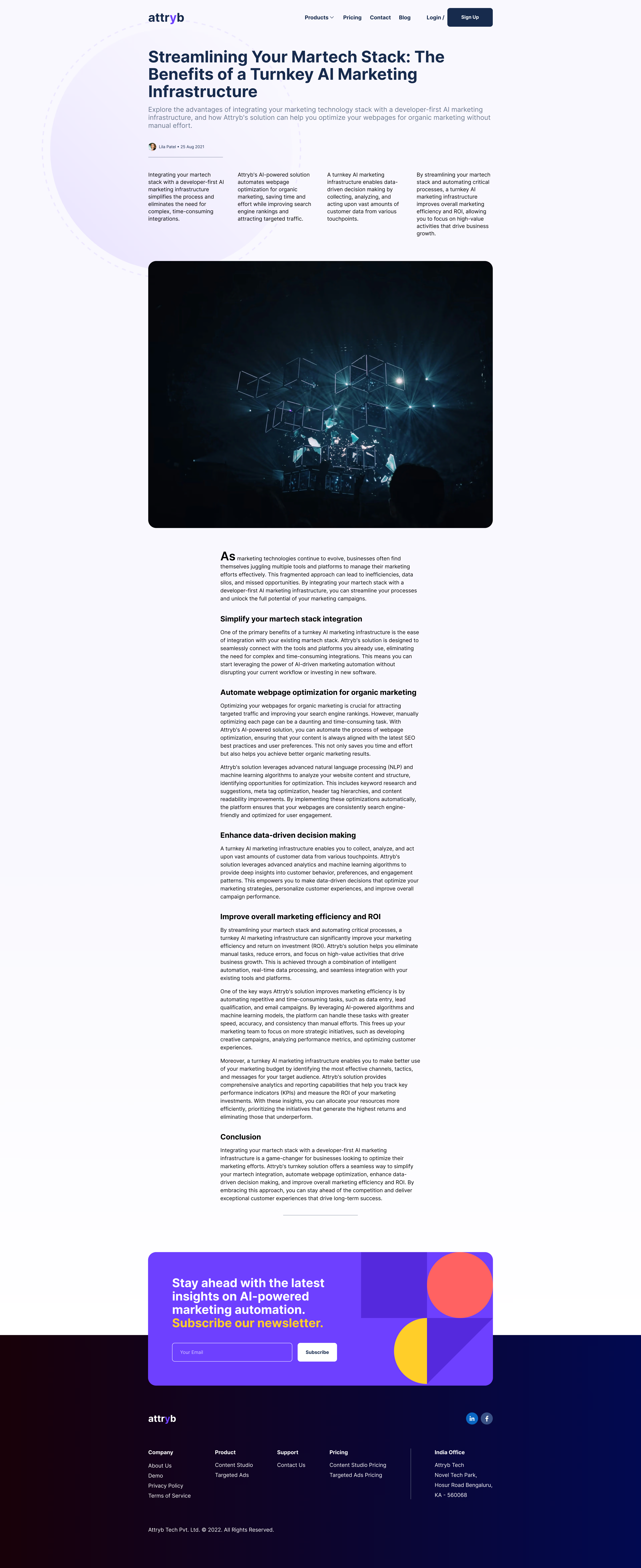
Individual blog post pages were designed to provide an immersive reading experience while encouraging engagement. We created a clean, distraction-free layout with ample white space and a large, readable font. The post template includes a prominent featured image, clear attribution to the author (with a link to their bio), and estimated reading time.
Social sharing functionality was integrated using React’s social media APIs, with sharing buttons that subtly appear as the reader scrolls through the content. At the end of each post, we added a related articles section to keep users engaged and encourage further exploration of Attryb’s content.
Outcome
The launch of the new Attryb website marked a significant milestone for both the company and our development team. The site has received overwhelmingly positive feedback from users and stakeholders alike, with particular praise for its intuitive navigation, engaging animations, and clear communication of Attryb’s value proposition.
One of the main challenges we faced was optimizing performance across a wide range of devices while maintaining the rich, interactive elements that make the site stand out. Through careful code splitting, lazy loading of components, and meticulous attention to asset optimization, we were able to achieve excellent performance metrics, with the site consistently scoring above 90 on Google’s Lighthouse performance audits.
A key lesson learned during this project was the importance of close collaboration between design and development teams from the earliest stages. By involving developers in the design process, we were able to identify potential performance issues early and craft solutions that maintained the design vision without compromising on speed or responsiveness.
Looking ahead, we’ve identified several areas for future improvement:
- Implementing a more robust A/B testing framework to continually optimize conversion rates.
- Exploring the use of WebAssembly for even better performance in computationally intensive areas of the site, particulary data visualization based demos.
- Expanding the use of micro-interactions to further enhance user engagement and guide users through the site.
Conclusion
The Attryb SaaS website project was a challenging yet rewarding experience that pushed the boundaries of what’s possible in modern web development. It allowed me to leverage my expertise in React and related technologies while also expanding my skills in performance optimization and animation techniques.
Perhaps most importantly, this project reinforced the critical importance of understanding the broader context and industry in which we’re working. By immersing ourselves in the world of MarTech and AI-driven marketing solutions, we were able to create a website that not only looks great but effectively communicates the transformative potential of Attryb’s products.
As I reflect on this project, I’m struck by how it has contributed to my growth as a developer. It has deepened my appreciation for the intersection of design and technology, enhanced my skills in performance optimization, and strengthened my ability to translate complex technical concepts into engaging user experiences. Moving forward, I’m excited to apply these lessons to future projects, continuing to push the envelope of what’s possible in frontend development.