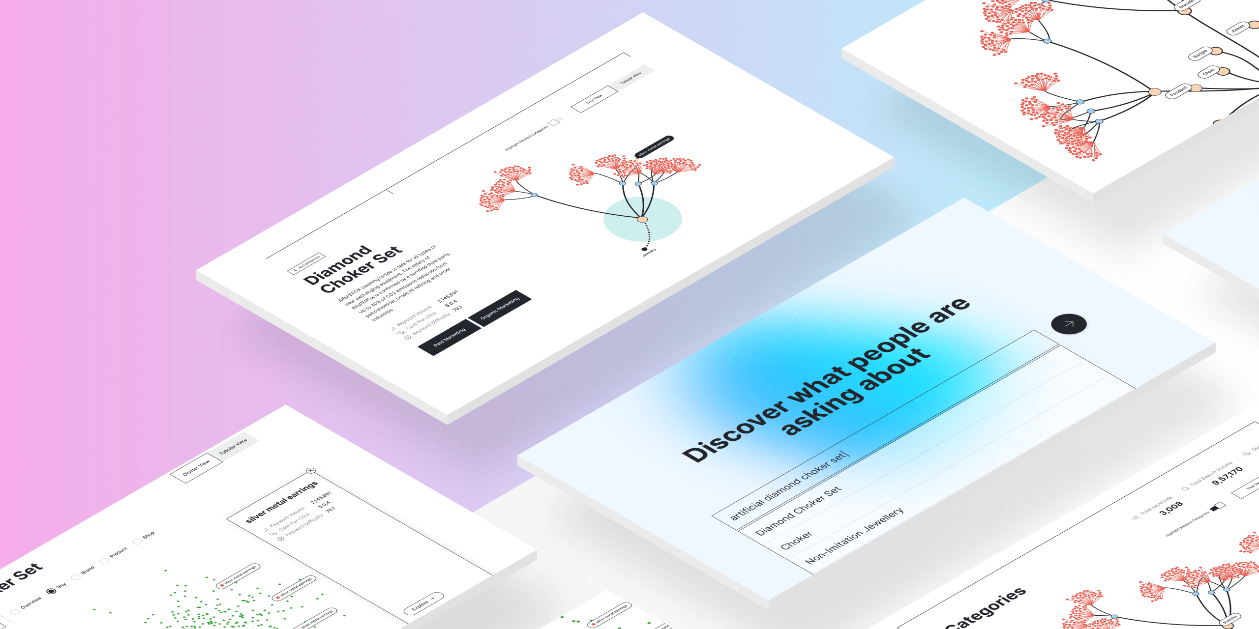
Technology Stack


Project Overview
As a lead frontend engineer, I was part of s challenging and exciting project for Attryb’s marketing website. The goal was to develop a data-driven landing page that showcases the scale and complexity of SEO keyword data the platform deals with.
This project goes beyond simple data presentation, offering users an intuitive interface to search, explore, and analyze SEO-related data with a focus on visualizing keyword relationships and clusters. By leveraging advanced visualization techniques, we’ve created a powerful tool that transforms complex SEO data into beautifully expressed insights.
Objectives
- Create a user-friendly search interface that allows marketers and SEO professionals to easily access and explore relevant keyword data.
- Develop interactive visualizations that effectively communicate the relationships between keywords and their associated metrics.
- Implement a scalable and performant solution capable of handling large datasets without compromising user experience.
- Showcase Attryb’s expertise in data analysis and visualization, positioning the company as a leader in the MarTech space.
- Provide valuable insights to users, helping them make informed decisions about their SEO strategies.
Domain and Industry Context
This project sits at the intersection of Marketing Technology (MarTech) and data visualization. In the rapidly evolving MarTech landscape, tools that leverage AI for personalization and data analysis are becoming increasingly crucial. Our SEO data visualization tool contributes to this ecosystem by providing marketers with powerful insights into keyword relationships and performance metrics.
The MarTech industry encompasses various subdomains, including Customer Relationship Management (CRM), Content Management Systems (CMS), Marketing Automation, and Data Management Platforms (DMP). This project primarily relates to the DMP subdomain, as it focuses on collecting, organizing, and activating SEO data for marketing purposes.
Data visualization in marketing is not just about creating pretty charts; it’s about transforming complex data into easily understandable and actionable insights. By visualizing SEO keyword data, we’re enabling marketers to identify patterns, trends, and opportunities that might otherwise remain hidden in raw data. This approach aligns with the industry’s move towards more data-driven decision-making in marketing strategies.
System Overview
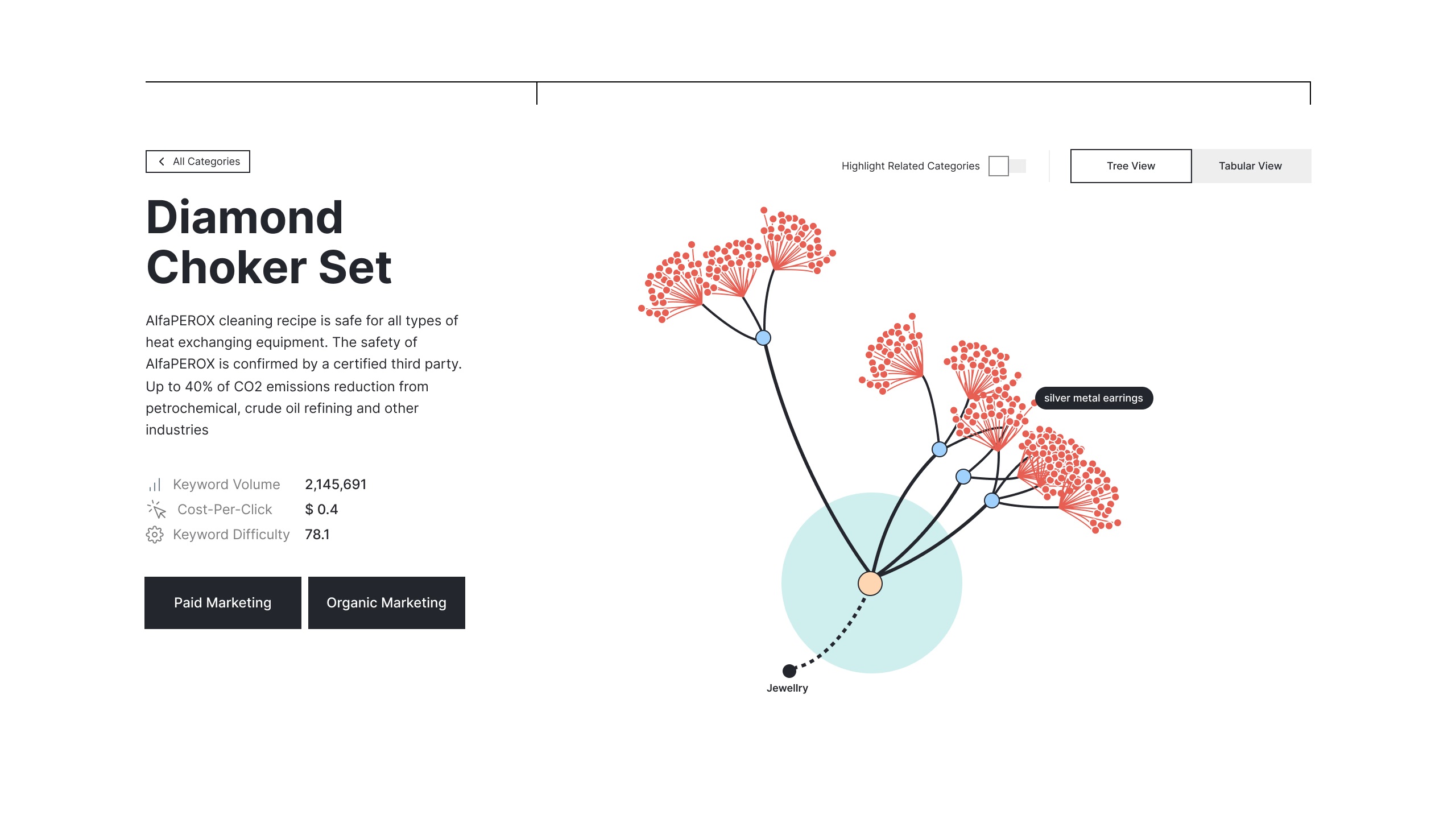
Behind the scenes, our project utilizes a robust backend system built with Node.js and PostgreSQL. This setup ensures efficient data retrieval and processing, allowing us to handle large volumes of SEO data with ease. The React frontend communicates seamlessly with the backend API, which queries the database, parses the data, and sends it back to the client in an optimized format.
One of the key challenges we overcame was developing an algorithm to translate the retrieved data into a tree structure compatible with D3.js for visualization purposes. This algorithm not only organizes the data hierarchically but also normalizes it for rendering in various graph formats, providing a foundation for our advanced visualization features.
Features
Search Interface
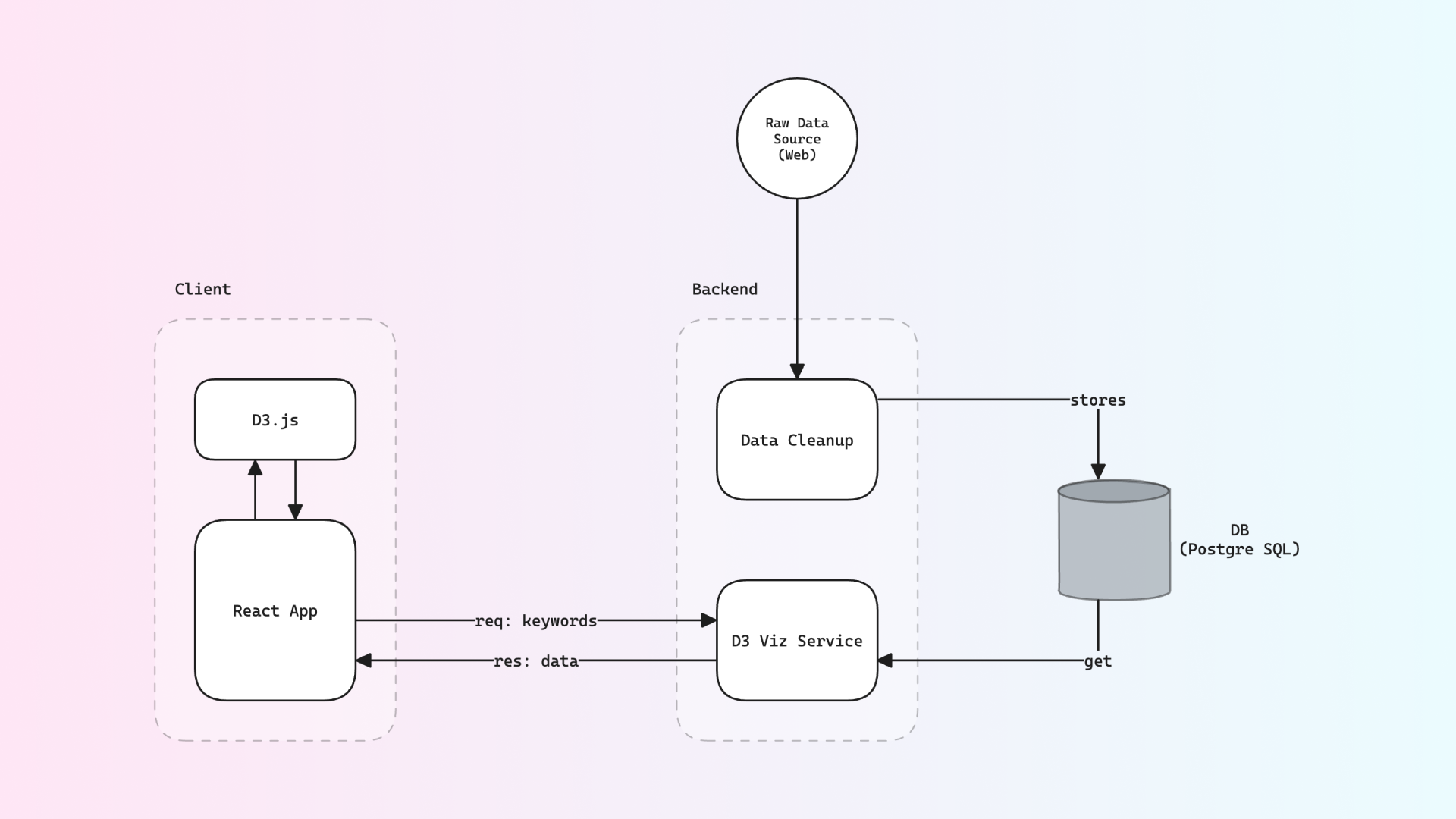
At the heart of our project is a powerful and user-friendly search interface. Users can input keywords and instantly access relevant SEO data. For instance, searching for “artificial diamond choker set” retrieves a wealth of information about this keyword and its related terms.
The interface is designed with simplicity in mind, ensuring that users of all technical levels can easily navigate and find the data they need. The search functionality is backed by an efficient algorithm that quickly retrieves and presents the most relevant information, making it an invaluable tool for SEO professionals looking to streamline their keyword research process.
D3 Tree Visualization
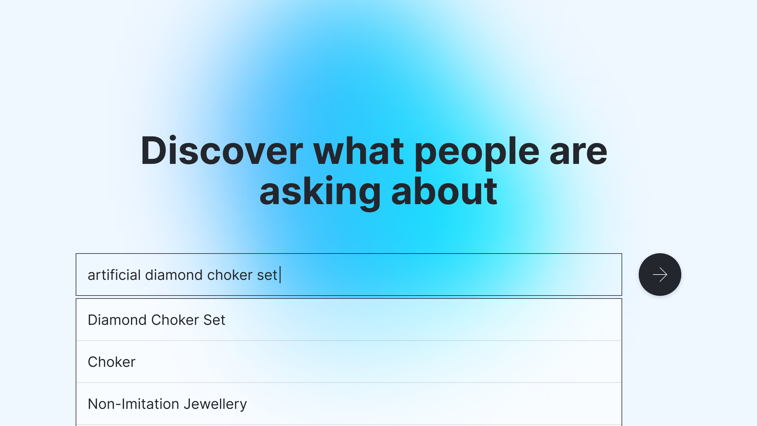
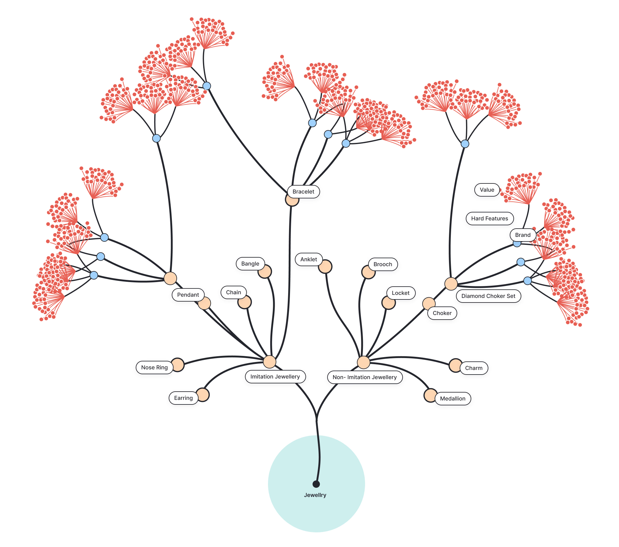
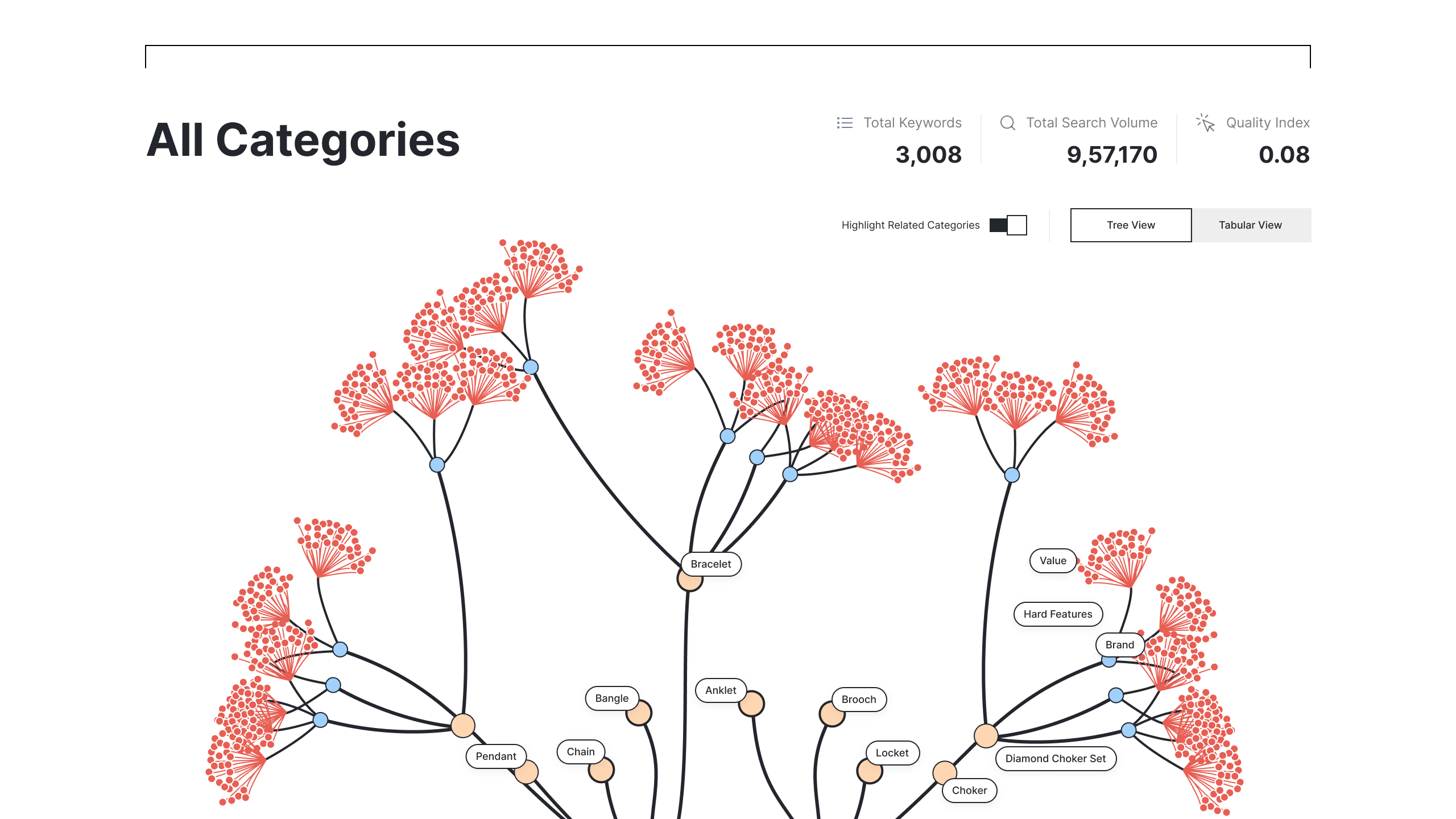
The D3 Tree Visualization is perhaps the most visually striking feature of our project. We implemented a full tree visualization using D3.js, where each leaf node represents a final keyword, and branch nodes represent the categories the keyword belongs to. This allows users to explore the entire keyword hierarchy at a glance, providing a bird’s-eye view of their SEO landscape.
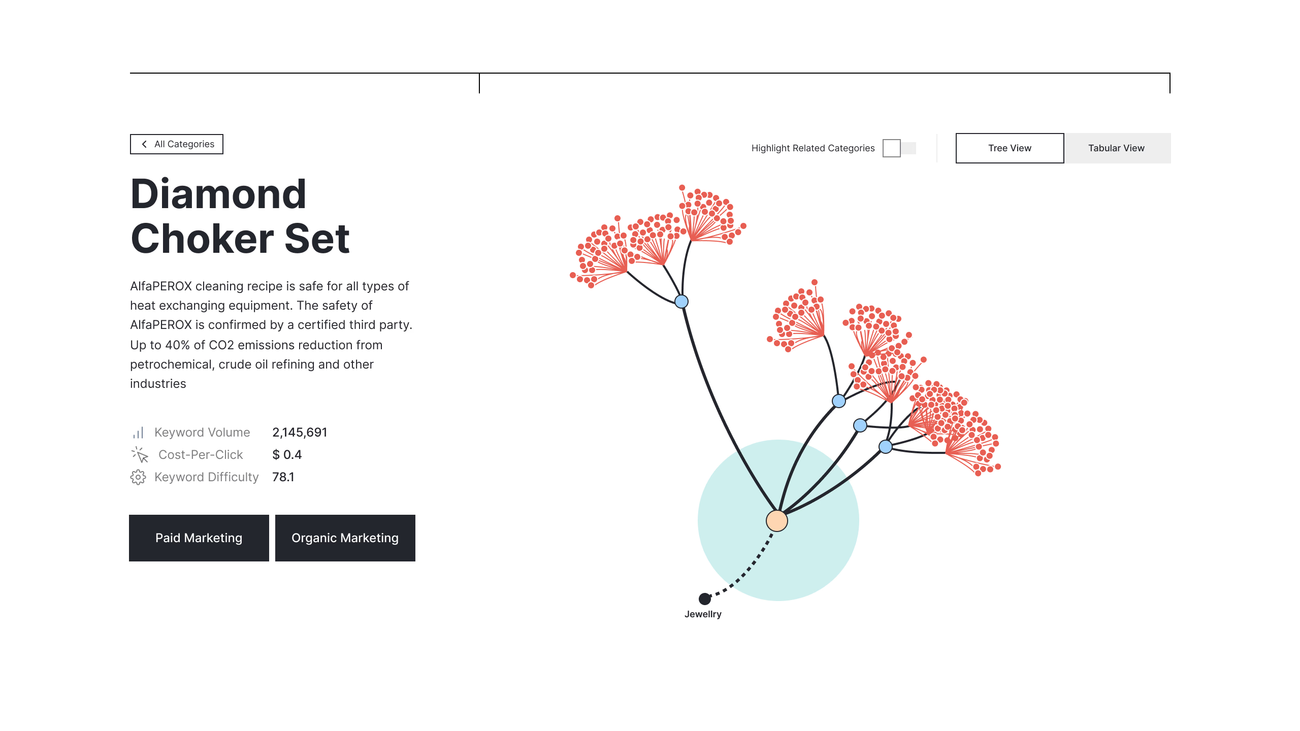
To enhance usability, we added an interactive element: users can click on a category node to render a sub-tree, displaying the cluster of associated keywords. This feature enables users to focus on specific keyword subsets, drilling down into the data that matters most to them.
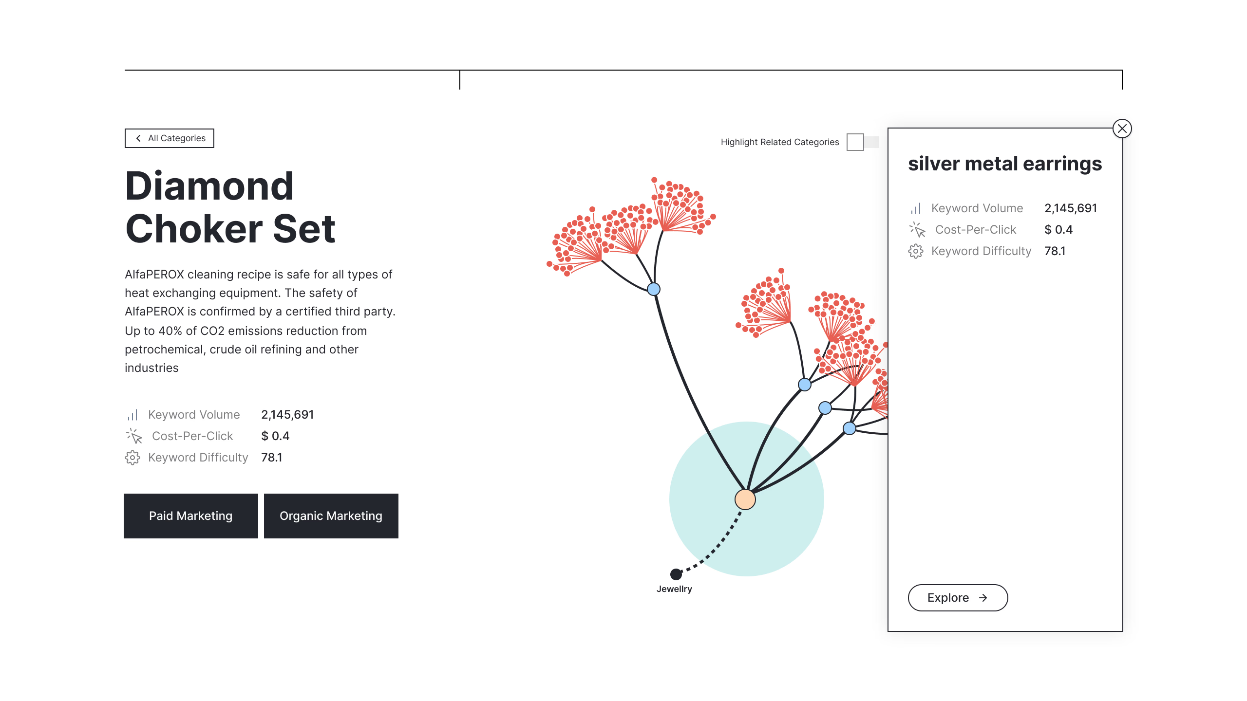
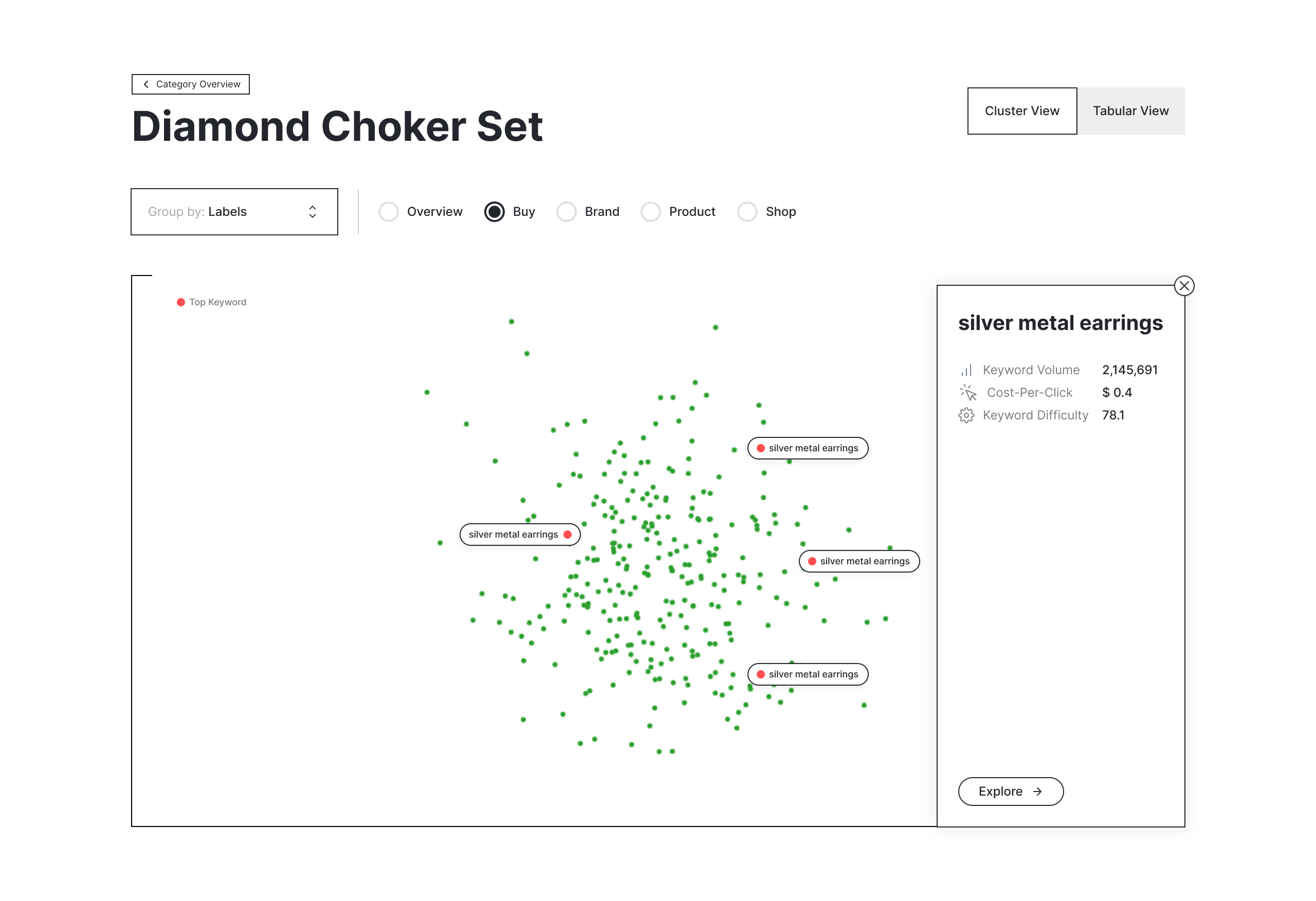
Additionally, we provided a detailed view of individual nodes upon clicking, presenting relevant information and metrics associated with the selected keyword. This combination of macro and micro views offers users unprecedented insight into their keyword structure and relationships.
D3 Scatter Plot Graphs
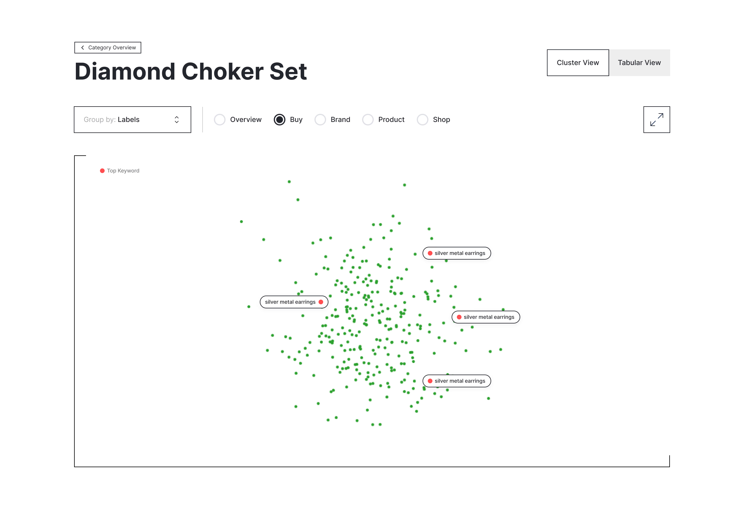
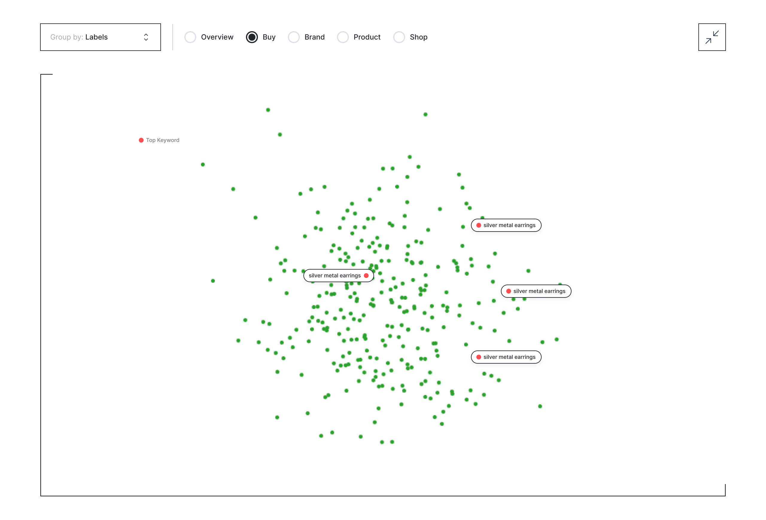
Complementing the tree visualization, we implemented interactive scatter plot graphs using D3.js. These graphs serve two primary purposes. First, they group keywords based on clusters defined by attributes beyond their associated categories, providing a different perspective on keyword relationships. Second, they offer an interactive exploration experience, allowing users to dive deep into keyword data, identify patterns, and gain insights that might not be apparent in a hierarchical view.
Users can hover over data points to see detailed information, zoom in on specific clusters, and even adjust the axes to visualize different metrics. This feature has proven particularly valuable for identifying high-potential keyword opportunities and understanding the competitive landscape in specific niches.
Outcome
The completion of this project marks a significant milestone in our efforts to make SEO data more accessible and actionable. By combining powerful search capabilities with intuitive visualizations, we’ve created a tool that not only meets but exceeds our initial objectives. Users can now explore their SEO data in ways that were previously impossible, uncovering insights that drive more effective marketing strategies.
One of the main challenges we faced was optimizing the performance of our visualizations when dealing with large datasets. We overcame this by implementing efficient data loading strategies and leveraging WebGL for rendering when necessary. This experience taught us valuable lessons about balancing visual complexity with performance, skills that will undoubtedly prove useful in future projects.
Looking ahead, we see several exciting avenues for improvement. Integrating machine learning algorithms to provide predictive insights, enhancing the tool with real-time data updates, and developing more advanced filtering options are all on our roadmap. We’re also exploring the possibility of creating a mobile version of the tool to cater to the growing number of marketers who prefer to work on-the-go.
Conclusion
This project has been a tremendous learning experience, pushing the boundaries of what’s possible in data visualization for SEO. As a senior frontend engineer, it has deepened my understanding of large-scale data handling and reinforced the importance of user-centric design in complex applications. The challenges we faced and overcame have sharpened my problem-solving skills and expanded my toolkit for tackling similar projects in the future.
Most importantly, this project has reinforced my passion for creating tools that not only look impressive but also provide tangible value to users. By transforming raw SEO data into intuitive, interactive visualizations, we’ve empowered marketers to make more informed decisions and develop more effective strategies. It’s projects like these that remind me why I love being a frontend engineer – the opportunity to bridge the gap between complex data and human understanding, creating experiences that inform, engage, and inspire.